![]()
The first KPI Chart we will be creating is the Total Sales KPI. The Total Sales KPI will show the Total Sales performance for the year. This will tell you at a glance if the company was able to hit or miss the success threshold that the company set for that year. Furthermore, this KPI will also show how the Total Actual Sales compares against the Total Budget/Forecasted Sales.
Create the Analysis
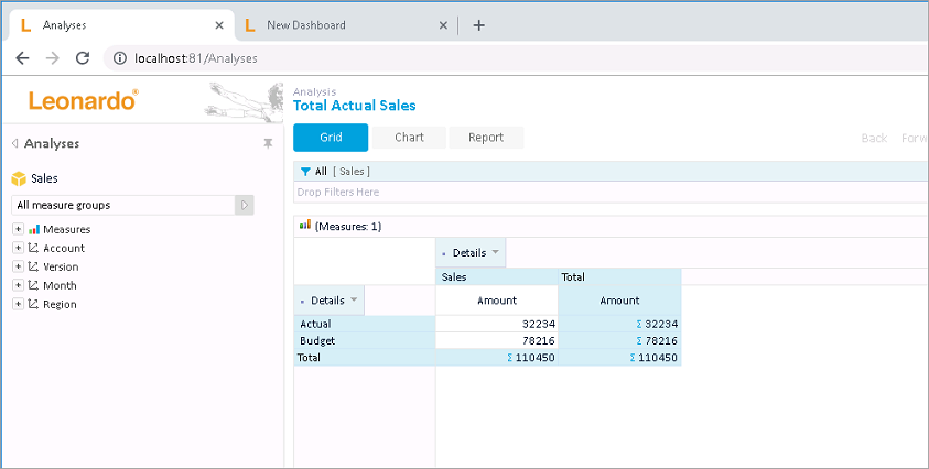
Create a new Leonardo Analysis and call it Total Actual Sales, with the following grid configuration. This grid shows Total Actual Sales and Total Budget Sales data.
Create the KPI: Total Sales KPI
To create the KPI:
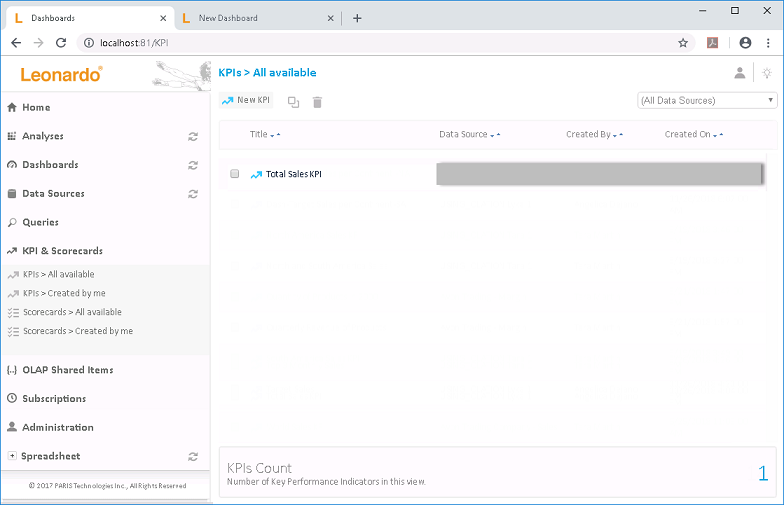
1. From the Leonardo main menu on the left-hand pane, click on the KPI & Scorecards menu (circled in the preceding image). This will display the KPI window along the right-hand pane.
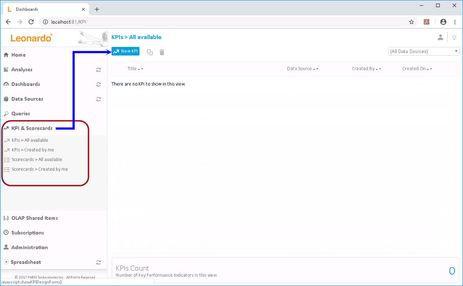
2. In the KPI window, click the New
KPI option (see where arrow points in the preceding image).
The KPI Design window appears.
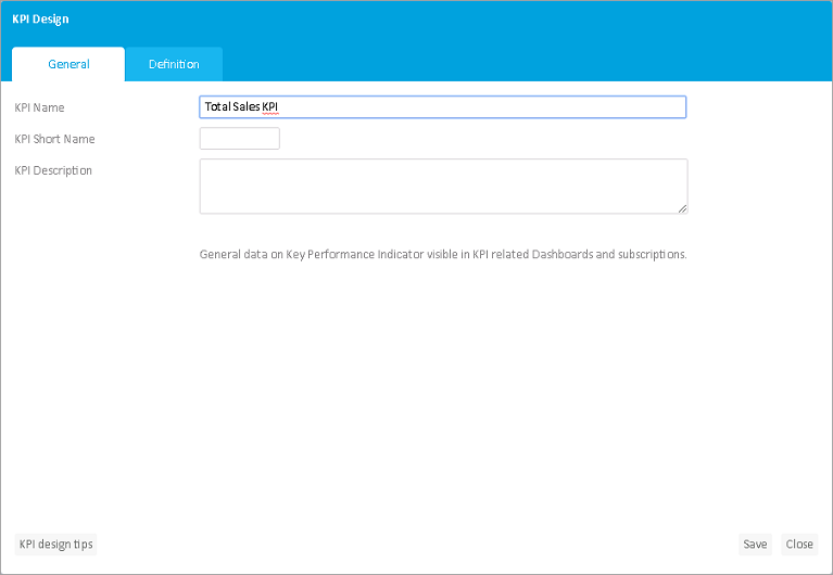
3. In the General tab, enter the <KPI Name>, i.e., Total Sales KPI.
4. Click the Definition tab to set KPI configurations.
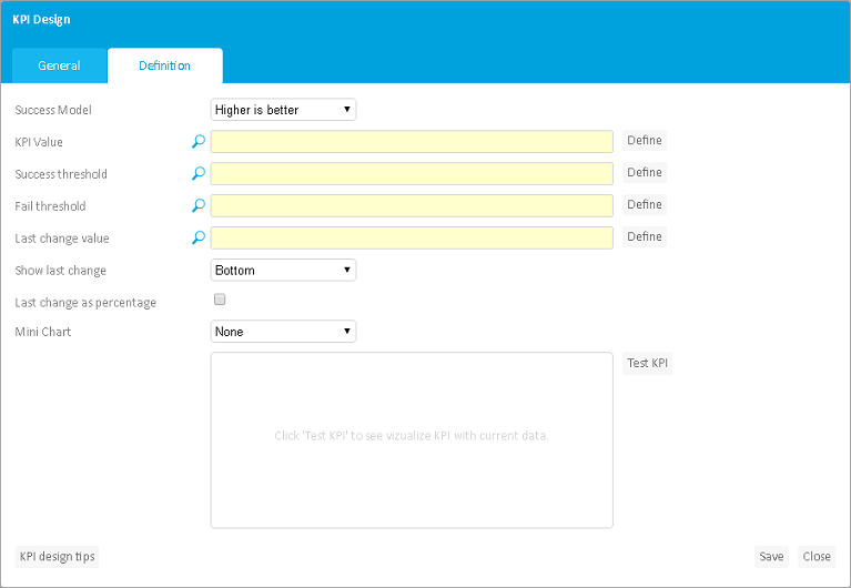
5. In the Success Model drop down, select Higher is better.
6. To set the KPI Value, click
the corresponding Define button (circled in the image below).
The Value picker (KPI Value) window appears.
You can specify the KPI Value in two ways:
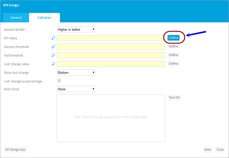

7. For the KPI Value, let us select
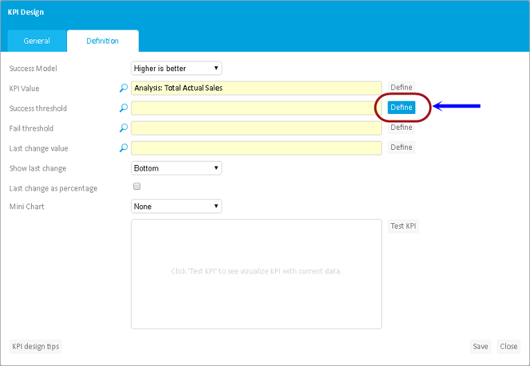
the Analysis we have just created earlier (i.e., Total Actual Sales).
To proceed, select the Value from Query/Analysis radio button, then
click the Select option (circled in the preceding image).
8. In the window that appears, click the Analyses tab and select Total Actual Sales.

9. Back in the Value picker (KPI Value) window, click Set (circled in the preceding image).
10. Next, set the Success Threshold by clicking
the corresponding Define button (circled in the image below).
The Value picker (Success threshold) window appears.
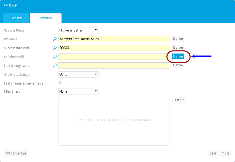
11. Select the Fixed numeric Value radio
button and enter the <success limit value>.
If the value is above the success limit, it will return a success indicator.
In this case, enter 30000.

12. Click Set (circled in the preceding image).
13. Next, set the Fail Threshold by clicking
the corresponding Define button (circled in the image below).
The Value picker (Fail threshold) window appears.
14. Select the Fixed numeric Value radio
button and enter the <fail limit value>.
If the value is below the fail limit, it will return a fail indicator.
In this case, enter 20000.
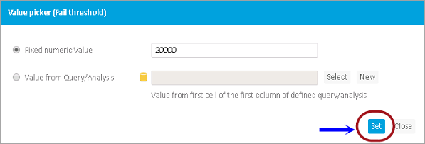
15. Click Set (circled in the preceding image).
16. Enable the Last change as percentage
checkbox.
This will display the last change value as percentage.
17. Use the Mini Chart option if you want
to display a line or column chart corresponding to your KPI value.
To do this, click the Mini Chart drop down and select a chart, i.e.,
Line Chart.
18. Leave the rest at the default settings.

19. Click Test KPI (circled in the preceding image), this will give a preview of what the KPI chart you have created will look like.
20. To complete the KPI creation, click Save
(found at the bottom right corner of the KPI Design window).
You will be prompted if the KPI was created successfully.

21. Click OK in the message prompt. You should see the newly created KPI appear listed in the KPI window.
Create the KPI Chart: Total Sales KPI
To add the KPI Chart:
1. In the New Dashboard window (Design Mode), click on the KPI Chart from the Chart toolbar and drag and drop anywhere in the screen. Again, since we are on the Free Position Dashboard layout, place the chart anywhere in the screen.
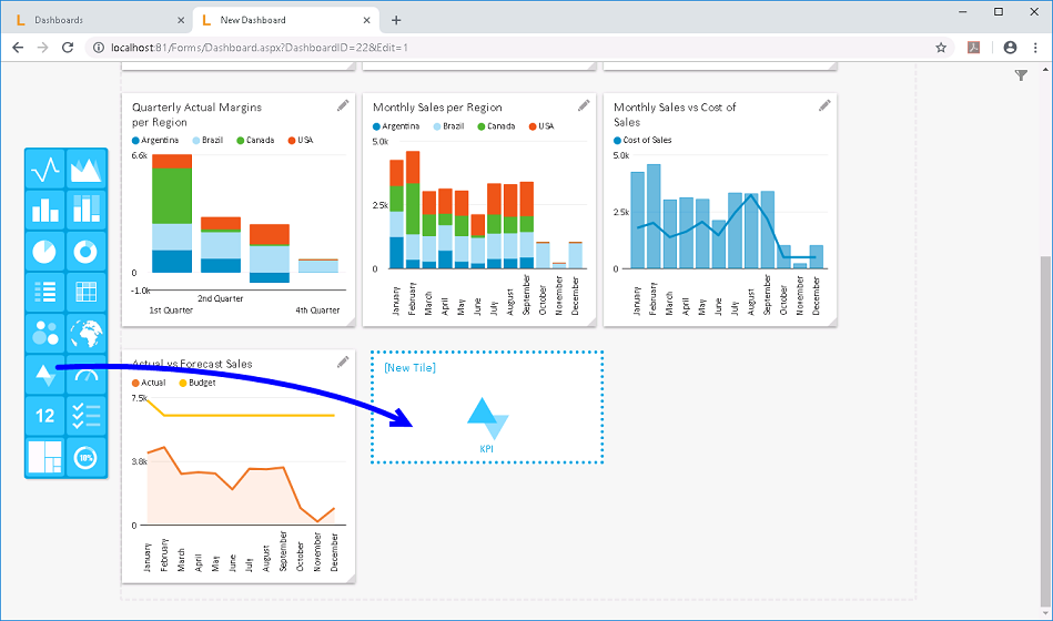
2. Go to the newly added Dashboard Tile
and click the pen icon.
The Tile window appears.
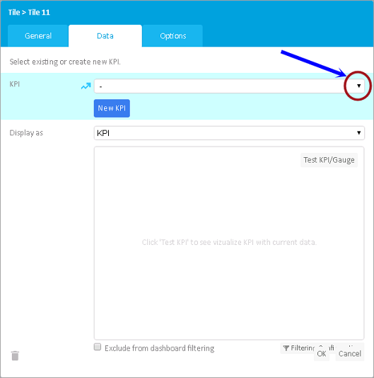
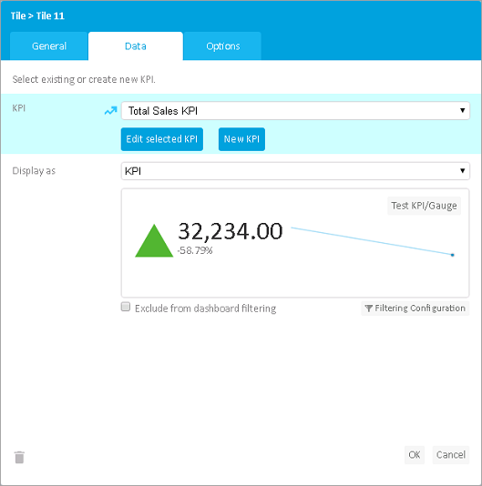
3. Go to the Data tab and click
on the KPI drop down (circled in the preceding image) and select
the KPI you have just created,
i.e., Total Sales KPI.
4. In the Display as field, ensure that KPI is selected.
5. Click Test KPI/Gauge to preview the resulting chart.
6. Go back to General Tab and enter the <KPI Chart name>, i.e., Total Sales KPI.

7. To finish Tile creation, click OK
(circled in the preceding image).
The newly created KPI Chart will now appear in the dashboard screen.
Again, you may resize the tiles, or do it later on.
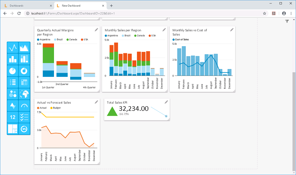
As can be seen in the Total Sales KPI
Chart, the indicator shows that the Total
Actual Sales for the year is 'Above' the SUCCESS threshold. The
first value (32, 234.00) is the Total Actual Sales for the year, while
the small number in percentage (-58.79%) corresponds to the difference
between the Actual vs the Budget/Forecast Sales. Since we can see that
the difference is a negative number/percentage, this implies that the
Actual Sales is in fact lower than the Budget/Forecasted Sales.
For reference on the
KPI Indicators, click on this link.