Yes, it’s Maradona, Maracana, and Multidimensionality
Using PowerOLAP to Analyze World Cup Data
It started with a limerick. Exactly why I decided to express in a 5-line poem the ridiculously named “hand of God” incident, when Diego Maradona punched the ball into England’s goal during the 1986 World Cup, I cannot now recall, but I did it and subsequently decided to embark on the challenge of writing a limerick for each the 19 World Cups from 1930 to 2010.
Maradona’s a cheeky wee bod
Who claimed to have scored with a nod
But ‘twas clear from the stand
It was not head, but hand
And Diego’s, not that of God!
It wasn’t long afterwards that the idea of a coffee table book, telling an alternative story of the World Cup, occurred to me. Along with the limericks would be stories of heroes and villains, controversial moments, injustices and assorted pieces of essential trivia.
But, as time went by, something wasn’t right. The answer was as painful as it was obvious; data, or rather the lack of it and therefore the need for it. It is all very well to think about a coffee table book along the lines I had been planning, but how limiting is that? What any sports story needs today is to be fueled by data; the very oxygen of sport.
In the case of the World Cup, we all accept that Brazil, with 5 wins, has been the greatest team throughout the years of the World Cup; but how much better than, say, Italy or Germany? And on what basis do we make that judgment? Surely it is more impressive to win well and with a high degree of difficulty, for example, to win far away from home, and against the odds? Answering these questions requires data across several dimensions: we are talking about countries, years, opposition, goals, tournament stages and host locations.
Creating an index to rank country performances seemed naturally to be a job for PowerOLAP. The first cube had to record the historic head to head results between each nation across all the years of the World Cup. Even before computing a country performance index, it was obvious that something had gone badly wrong with the beautiful game, in that the ‘goals per game’ measure had fallen off a cliff after 1958, and has never been more than 3.0 since then. This is one of the reasons the 2014 World Cup was so highly regarded; over the whole group stage, the ‘goals per game’ score hovered around 3.0, and it was only in the tenser and more tightly contested knockout stage that this fell to finish at 2.67. Anyway, at least 2014 saw an uptick in this measure, the first such uptick since 1994, as can be seen in the graph below. But it is unlikely that we will ever return to the halcyon days of 1954.
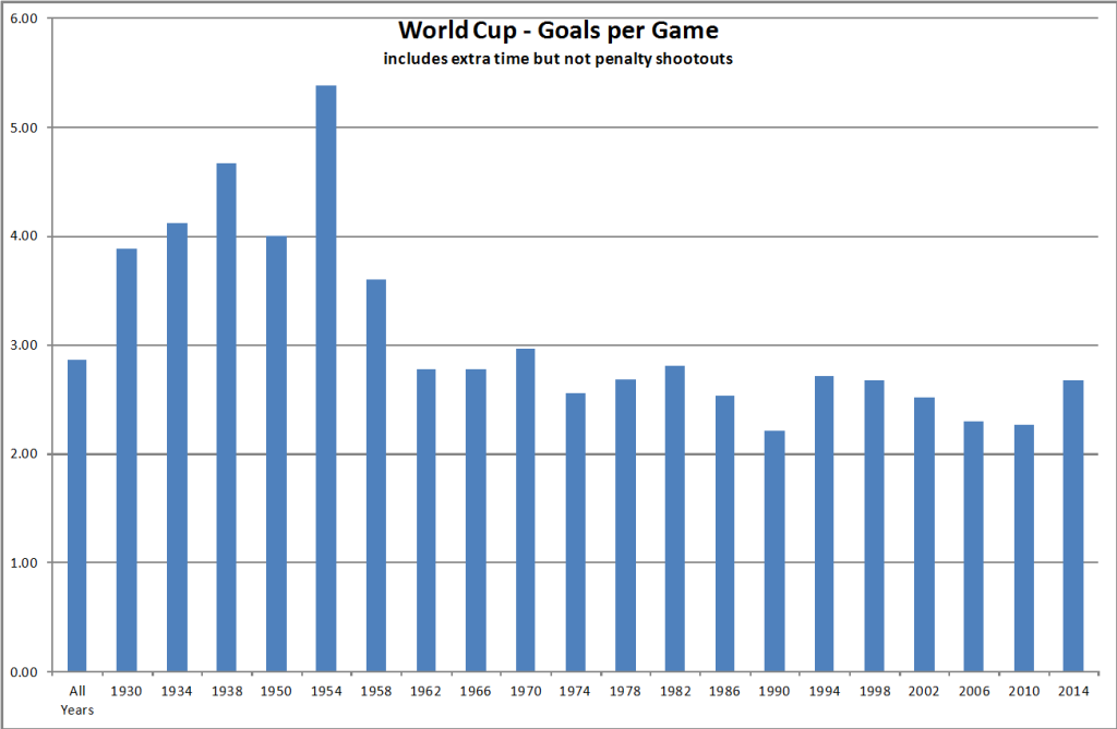
World Cup – Goals per Game
When the country index was formulated and applied across all results and years, it was no surprise to see that Brazil had indeed scored the best. However, the scale of Brazil’s lead over Germany and, certainly Germany’s lead over Italy, was perhaps a surprise, particularly when you consider that Italy have won the World Cup 4 times, see graph below.
This really does come down to the degree of difficulty of winning the World Cup. Italy’s wins have all come close to home: in Italy, France, Spain and Germany, whereas Brazil has won in far-flung places: Sweden, Chile, Mexico, USA and Japan. This is reflected to some extent in the index.
The graph of these top 25 countries is perhaps one you might find in a science textbook, measuring some kind of decay. One great World Cup tournament from a team ranked between 5 and 25 would certainly make a significant difference to their position in the chart.
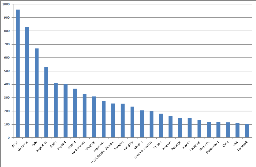
Top 25 World Cup Countries
But the World Cup is not just about how countries perform. Stars are born. Reputations are made or destroyed, and watching over everything are the clubs, waiting to sign up the next marquee name for the new season. Shouldn’t a story about the World Cup also be about the clubs and the players? Of course it should, and this means more data and more work for PowerOLAP.
So, the next cubes needed to capture, for each match, how the players had performed. Data available as a matter of public record includes the squads chosen, the starting line-ups for each match, the minutes played for each player, and whether or not each player scored goals, received a yellow or red card or was substituted; all meat and drink for PowerOLAP. And, of course, each player, in each World Cup is contracted to a club. It is also therefore possible to slice the data to extract the club view and so answer a World Cup question rarely asked: ‘which club has been the most influential on World Cup history?’
It seemed a fair way to assess a club’s impact by considering both the number of minutes played by players from that club and the number of goals scored. A goal is assigned a value and added to the number of minutes played to reach an index. As can be seen from the graph below which shows the top 10 clubs, Inter Milan comes out top. This is based on data up to the start of the 2014 World Cup. From the performance at Brazil 2014, Bayern Munich would now be the top club overall, helped in large part to a contribution of 18 goals scored by Bayern Munich players.
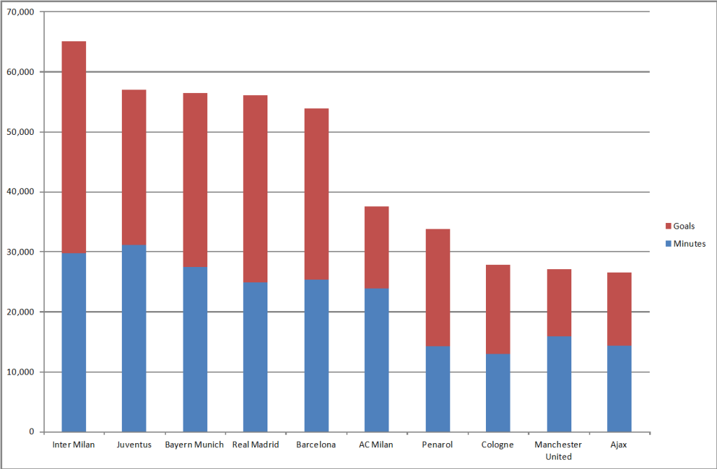
Which Club has been the most influential in World Cup History?
If you are a football fan, you might be surprised to see Inter Milan to be heading this illustrious list. Certainly the graph implies there is a “big 5” and then a long list of other clubs trying to bridge the gap. In particular there seems to have been a disproportionate number of goals contributed by these 5 clubs.
We can see who the main contributors are to Inter Milan’s success, by delving a layer deeper into PowerOLAP’s cubes. In the graph below, showing the top 15 contributors to Inter Milan’s World Cup index, the top 10 all contribute more to the index through goals scored than through minutes played.
Brazil’s Ronaldo was the World Cup’s leading scorer with 15 goals, until overtaken in 2014 by Miroslav Klose of Germany. 12 of those 15 goals were scored when he played at Inter Milan, and the other 3 whilst at Real Madrid. You have to go all the way down to 15th place to find a player, Giuseppe Bergomi, whose contributions to the index do not include any goals scored.
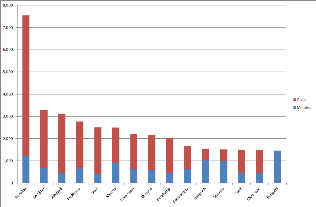
Top 15 Contributors to Inter Milan’s World Cup Index
As a final illustration of how PowerOLAP can help with the World Cup story, I put forward the classic debate between football fans: “who was better: Pele or Maradona”? Surely such a question should not be answered purely on emotional grounds but by an analysis of their World Cup records?
We can group the data relating to each player into categories which are important criteria of their abilities and influence. I have chosen playing time, goals, winning record, leadership and discipline. There may be others, but these 5 seem to me to encapsulate what these two great players were all about.
As you can see from the table below, it is a close call, but Maradona gets hammered on his disciplinary record, and so Pele comes out with an overall higher score and, in this analysis, wins the title of the greatest World Cup player of all time.
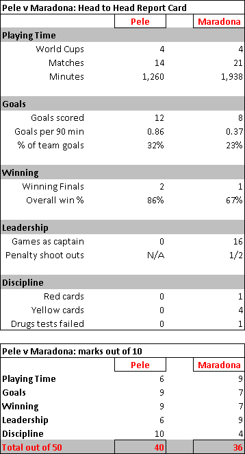
Pele vs. Maradona Report Card
So, this is how PowerOLAP has fueled the story of the World Cup. It is perhaps surprising to read an article such as this as an endorsement for an OLAP software tool, traditionally positioned in the domain of accounting and reporting. But if there is a story to tell, there is surely a wealth of data behind that story, and what better tool to use than PowerOLAP? It has the robustness, flexibility and scalability to provide the support to this story, “the greatest show on earth”, that has endured for 84 years, engaging more than 80 nations from 6 continents, hundreds of clubs and thousands of players.
You can read the whole World Cup story at www.worldcupstory.com, although the data on the site has not yet been updated for the 2014 tournament, which culminated with Germany’s triumph over Argentina at the Maracana stadium.


